Visit our Blog and Subscribe!
As a wholesale supplier, we understand that our customers prefer to market our products with their own brand. To do so is simple:

Within the envelope, a compelling offer calls out to the recipient. Then that recipient answers these essential questions:
Much has been written about creating the offer, targeting the audience, and even organizing contents to maximize response. We go to great lengths to create what’s inside the package. Yet, like baseball, without an at-bat you can never hit a home run. Getting the outer envelope opened gives you the at-bat you’ve worked so hard to achieve.
The possibilities for a winning outer envelope are almost endless, but here are some solid ideas I’ve seen over the years to help you get those at-bats:
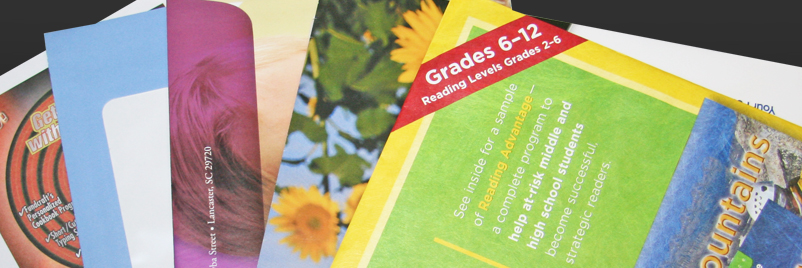
Paper upgrade. This will enhance the sender’s image in the recipient’s mind. The feeling and look of a fine paper creates mystery about the perceived value of the contents. Of course, the contents need to echo the upgraded appearance. Healthcare providers, financial planners, real estate developers and politicians (yes, it’s that time again) are popular users of fine paper options. Color your world. An enhanced, 4-color image on the envelope brings your message to life. With today’s technology you can create short-runs as well as long-runs using digital, offset or enhanced flexographic printing. The cost has been driven down with technology improvements. Nonprofits love the “picture is worth a thousand words” approach.
Larger and unique is better. Everybody recognizes No. 10 envelopes. Be different to get noticed. Envelopes can be 6-1/8 x 11-1/2 and still receive letter-size postage rates. Somewhere short of that, but still within the letter mail aspect ratio of between 1.3 and 2.5, there’s an opportunity to use more real estate for creative copy, more windows for “peeks” into the contents, and less chance of someone just like you in the customer’s mailbox. Go larger than the maximum letter size, such as a 9 x 12, and your postage goes to “flats” rates. Don’t dismiss this option based on cost alone. Its uniqueness in the mailbox along with the presentation of unfolded collateral can produce a winner.
Add an intriguing feature. Unique opening devices like Tear-ific® and EZ Open™ are opportunities to improve response. Engage the recipient with the envelope. The goal is to get the envelope opened. QR codes are another option that’s been popular since the July/August 2011 USPS Mobile Barcode Promotion. Linking mail to digital media creates more engagement. But make sure the landing page is mobile-enabled and relevant to the mailing’s contents.
Green ways. Environmental messages implied in the mail piece design have to be important to the mailer. Recycled and/or forestry certified paper is economical today. Also, the reusable envelope market is starting to take hold. This gives mailers a green message, plus engaging opening devices like those mentioned above. But make sure green messages make sense for you or your client’s organization—insincerity is one message you do not want to project.
These ideas only scratch the creative surface. There is a lot to consider when choosing the proper envelope: the audience, the timing, the offer, competition and of course, the budget. Bring an envelope marketing expert onboard early in the process and discuss concepts. There are so many new ideas and options to consider; the last thing you want is to short-change a potentially great result for you or your client.